
To change Samsung's built-in Color palette, open Settings > Wallpaper and style > Color palette. Enable it, choose Wallpaper colors or Basic colors, review the preview and tap Apply. You can also enable Apply palette to app icons for supported icons.
This is a useful place to begin when you want matching interface colors without creating a full theme. I'll show you how to choose a palette, check the result and recognize when you need a different customization tool.
Open Color palette from Wallpaper and style
Samsung's current US theme and icon instructions document the built-in palette under Wallpaper and style. This is a Settings feature; you don't need to start by installing a Good Lock module to reach it.
- Open Settings on your Galaxy.
- Select Wallpaper and style.
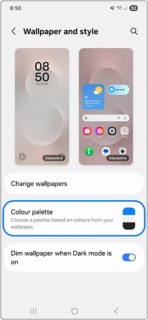
- Tap Color palette.
- Enable the Color palette switch if it is off.
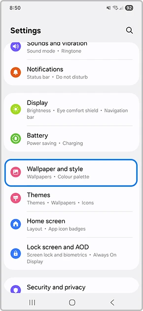
Samsung's Australian instructions use the spelling Colour palette, while the US guide uses Color palette. They describe the same type of setting. Look for the label used by your phone's language and region rather than assuming a spelling difference means a missing feature.
Choose wallpaper-based colors or a basic color
Wallpaper colors gives you palette suggestions associated with your current wallpaper. Basic colors offers solid-color choices. Samsung's US instructions also note that you can swipe through more available options.
| Option | Use it when | What to inspect |
|---|---|---|
| Wallpaper colors | You want interface accents that relate to the wallpaper | The suggested palette and its preview |
| Basic colors | You would rather choose a solid accent | The selected color before applying it |
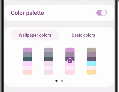
For example, you may like a wallpaper's photograph but prefer a simpler accent for menus. Compare Basic colors with the suggested wallpaper palettes before changing the image itself. The palette selection lets you make that color choice separately.
Use the preview at the top of the palette page to inspect your selection. Samsung documents that preview as the way to see the proposed appearance before applying it. If a pale accent is difficult for you to distinguish, compare another available choice while you're still on that page.
Apply the palette and inspect the places you use
- Select the palette you prefer.
- Check the preview for the proposed colors.
- Choose whether to enable Apply palette to app icons.
- Tap Apply.
- Open the menus and Home screen you normally use to decide whether you want to keep the result.
Samsung Australia's illustrated setup also ends with selecting a palette and tapping Apply. Choosing an option in the preview is the selection step; applying it is the step that saves the change.
Look at more than the wallpaper thumbnail when deciding. Your Settings menus, interface controls and supported app icons are where you will encounter these colors during normal use. You can return to the same palette page and compare another selection if the first result doesn't suit you.
Color choice and text size answer different needs. If labels are hard to read because they're too small, Samsung's font size and screen zoom guide explains those controls. Recoloring a label won't give you the same result as making the label larger.
If the Apps screen background looks wrong, our One UI 9 app drawer blur guide covers that separate problem.
Decide whether to recolor app icons
The Apply palette to app icons switch is optional. You can use the palette for menus while leaving that icon option off, or enable it if you prefer the supported icons to coordinate with the interface.
Samsung cautions that the palette may not be available for certain app icons. An icon retaining its own appearance can therefore be a support limitation. Compare which icons changed before assuming the palette failed across the phone.
Sorting the icons is another independent choice. Our Apps screen sorting guide covers Alphabetical order and Custom order. Choose colors for appearance and sorting for where you find the apps.
When Theme Park is the more relevant tool
Samsung's Good Lock directory describes Theme Park as a separate theme creator. It supports wallpaper-based recommended colors and independently themed components such as the keyboard, Quick settings window, volume controls and icon packs.
That distinction helps you choose a sensible starting point. For a coordinated menu accent, use the built-in palette described here. For a particular icon shape or a separately designed volume panel, inspect the corresponding Theme Park editor offered on your supported device.
Record which tool you're using before changing another design. A Color palette preview and a saved Theme Park design belong to different controls. Comparing one change at a time makes it easier to identify the setting responsible for the appearance you want.
FAQ
Does Color palette replace the wallpaper picture?
Samsung documents the palette as colors applied to menus and screens. The Australian reference shows Change wallpapers as a separate entry above Color palette. If your goal is a different photograph, use the wallpaper control rather than searching the palette choices for an image selector.
Which details help when my result differs from the preview?
Tell me your Galaxy model, One UI version, whether you chose Wallpaper colors or Basic colors and whether the icon switch was enabled. Also mention an applied theme or Theme Park design. Describe which menu or icon looks different so we can compare that specific result.
Was this guide helpful?
Your answer helps us keep it accurate.
Comments (0)
Comments are moderated, and published only if they are relevant to the topic and add value in a constructive way. If you disagree with something, please be polite and respectful.